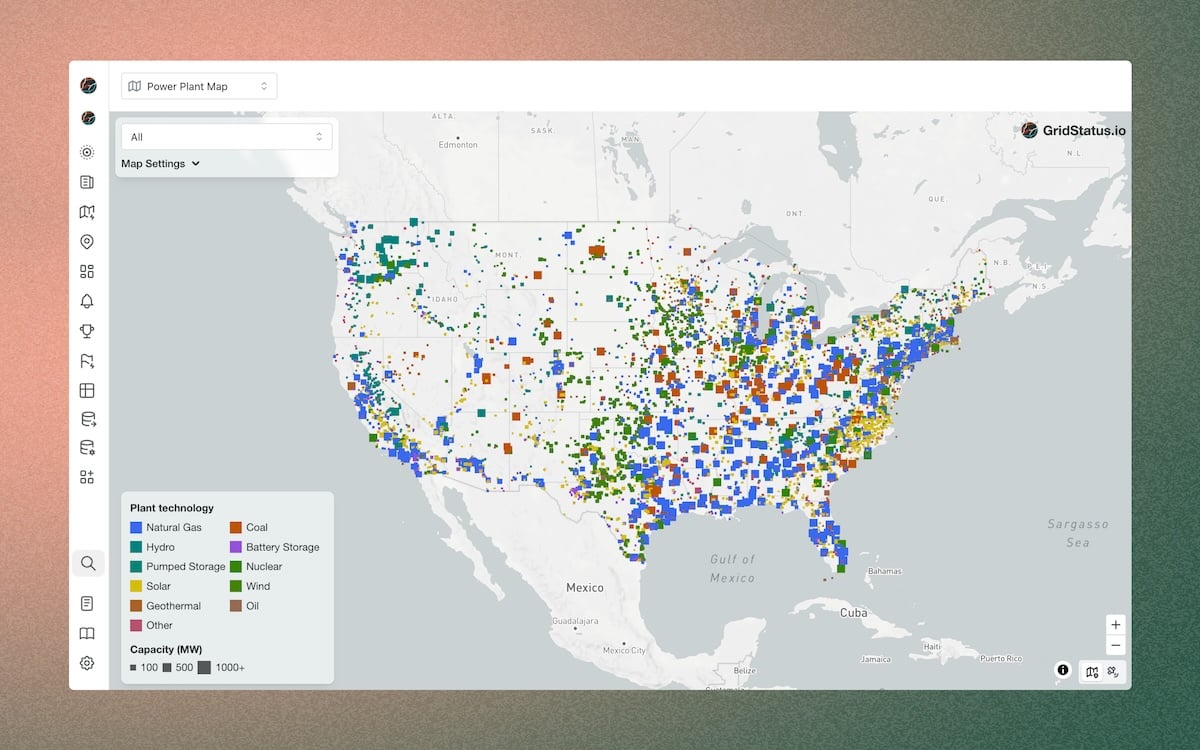
This isn't a map of roads; it’s a map of where our juice comes from. It’s the nervous system of the United States, showing every single utility-scale generator.
When you first open it (and you should open it, go ahead, I’ll wait), you’ll see a blanket of dots. It looks like someone spilled a bag of pixels on a country-shaped cookie.
But look closer. The colors are a code: green for hydro, orange for gas, grey for coal, blue for nuclear. It tells you exactly how your state powers your Netflix binge.
The Old Giants Are Dying (And It’s Kind of Sad)
Zoom into the Ohio River Valley or West Virginia. See all those grey dots? Those are coal plants. Many of them are giant, ancient, and puffing their last breaths.
My personal favorite on the map is a plant in Pennsylvania called "Sunbury." It’s grey, it’s old, and it’s retired. The map lists it as having a "Nameplate Capacity" bigger than your entire street’s transformer.
It’s like looking at a dinosaur skeleton in a museum. You know it was powerful, but now it’s just a data point on a ghost map. Coal is fading, and this map lets you watch the obituaries in real-time.
Renewables Are Here, But They’re Shy
If you look at the blue and yellow dots (solar and wind), you’ll notice a pattern. They cluster in very specific, inconvenient places. Wind turbines? They’re in the middle of Kansas, Texas, and the windy corridors—places you’ve driven through and thought, "Why does anyone live here?"
Solar, meanwhile, is a desert dweller. The massive solar farms are in California, Nevada, and the Southwest. It’s ironic: the places with the most sunshine are often the least populated.
 Interactive Map of U.S. Power Plants | Grid Status
This creates a funny problem. How do you send power from a lonely solar farm in the Mojave Desert to a guy watching 4K porn in downtown Chicago? The map doesn't show the transmission lines, but it hints at the chaos.
The Nuclear Question: Tiny, Mighty, and Scary
Now zoom in on the East Coast or the Great Lakes. Those blue dots are nuclear plants. They are tiny dots, but when you click on them, you see their capacity is massive—often 1,000 megawatts or more.
Compare that to a gas turbine (orange dot) that might only put out 50 megawatts. One nuclear plant does the work of twenty gas peakers. It’s quiet, clean, and terrifyingly efficient.
And yet, look at how few there are. They are like rare Pokémon. The map shows you just how much of our clean energy relies on these 50-year-old behemoths that are chronically underappreciated.
Natural Gas is the Cheat Code
If you want to see the king of the US power grid, look for the orange dots. They are everywhere. In Texas, they are as common as pickup trucks. In Florida, they are as common as humidity.
These are natural gas plants. They are the backup singers that became the lead vocalist. They can turn on quickly, turn off quickly, and they burn cleaner than coal.
The map shows you the uncomfortable truth: we are currently running on a fossil fuel that is slightly less evil. It’s the "diet soda" of the energy world.